Hotel Indigo and On The Grid value your feedback.
Please complete a quick 2 minute survey to tell us about your experience.
The guide to Expo 2015 for design lovers. If we say SoHo, everyone thinks of a specific area of Manhattan (or London, if you are British). However, in New York City, SoHo stands for South of Houston Street. Here we are at Expo 2015; we are not as clever as in New York, so we have no SoDe (South of Decumanus). That said, if we organized names like in New York (NoLIta, North of Little Italy; NoMad, North of Madison Square Park, etc.), we would get SoDe. The south side of the matter. Piero Ciampi would have said: “[the roaring south](https://www.youtube.com/watch?v=F08NeU_97qY)”. This area was curated by the Social Media Team Expo 2015. All photos by Beatrice Bianchetti and Anna Chiara Maggiolini.
The only pre-existing building on the exhibition site.
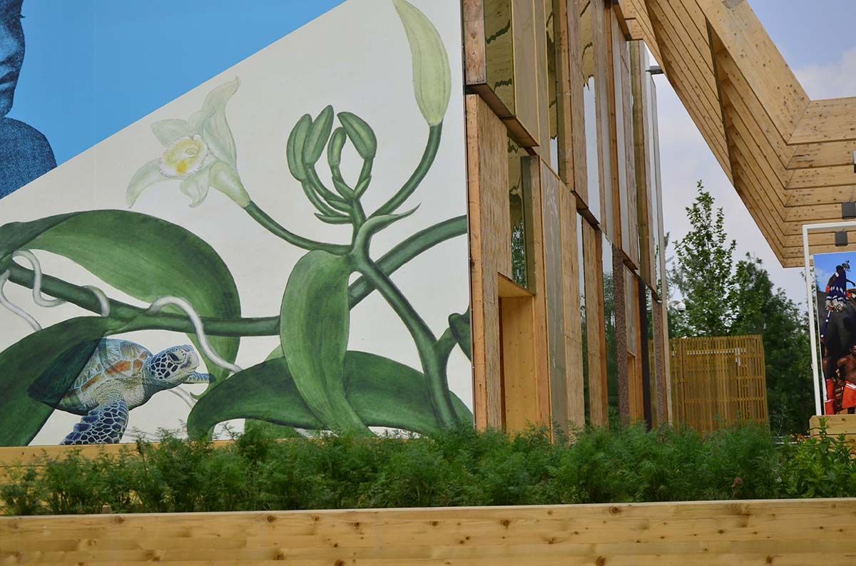
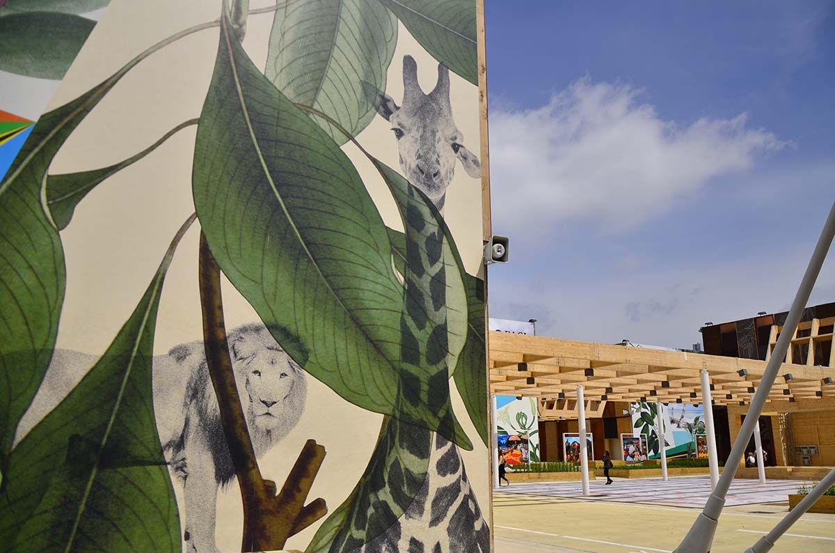
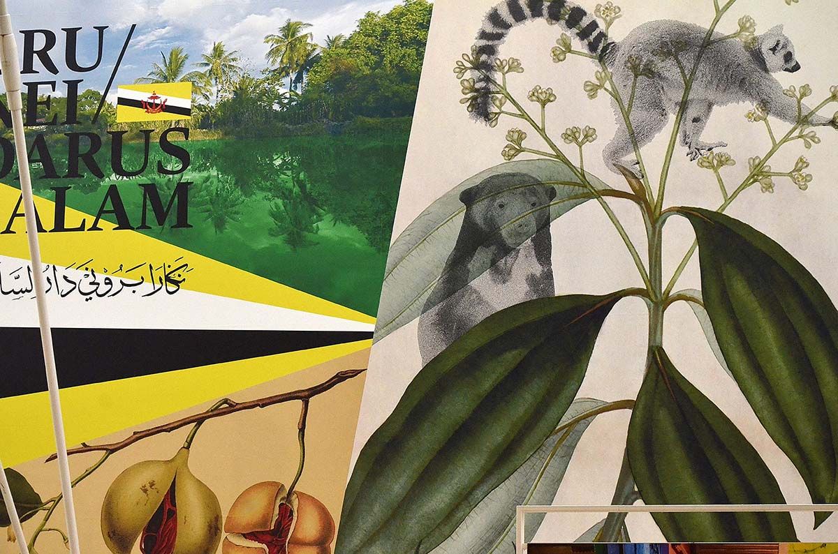
Colours, typographical games, antique botanical illustrations, murals with flowers, leaves, fruits. The Spices Cluster, the communication and decoration graphic set-up of which was designed by [Studio FM Milano](http://www.studiofmmilano.com/EN/Work/spices-cluster-expo-2015/), is a real pleasure for the eyes. Flashy, yet discreet. Appealing, fun. A large collage where we get lost among saffron plants, colourful birds and large backgrounds of strong colours. A rich and festive graphic design with strong exotic taste, but at the same time refined and magical, where spices are expressed through the representation of the wealth of nature that produced them. When the project is 100% graphic... Thumbs up!
Please complete a quick 2 minute survey to tell us about your experience.